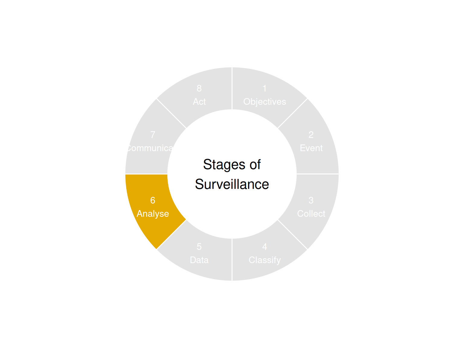
9 Analysis and Assessment (Stage 6)
Be true to yourself
The analysis and assessment stage involves the calculation of relevant indicators, examining data through the lenses of time, place, and person, assessing the results by drawing of conclusions and eventually formulating recommendations. Essentially, this stage transforms raw data into actionable information, aligning with the “data–information–knowledge–wisdom” hierarchy1.
The complexity of analysis varies significantly across scenarios:
- Straightforward cases: Some situations demand immediate action based on clear indicators. For instance, a reported case of Ebola in a returning traveler unequivocally signals the need for prompt intervention.
- Complex scenarios: Other situations require nuanced interpretation and extensive expertise. For example, determining whether a relative increase in a SARS-CoV-2 variant warrants action involves intricate analysis and often necessitates collaborative evaluation among experts.
9.1 Analysis
9.1.1 Surveillance indicators
The analysis process begins with data from the processing stage, typically structured in spreadsheets or databases. From this foundation, surveillance indicators are computed based on the specific objectives of the surveillance system. Here are key indicators often used in health surveillance:
| Indicator | Description |
|---|---|
| Count | Total number of cases meeting the relevant definition |
| Incidence proportion | Probability that a particular event has occurred in a specified period. |
| Incidence rate | Frequency of new occurrences of a medical disorders in the studied population at risk of the medical disorder arising in a given period of time. |
| Prevalence proportion | Proportion of a defined population affected by a particular medical disorder at a given point in time, or over a specified period of time |
| Hospiatlisation rate | Incidence rate for cases of a disease that are hospitalised |
9.1.2 Graphical Display
In addition to computing indicators, data visualization plays a crucial role in making complex information easily interpretable. Graphs transform raw data into visual representations that are readily understood by humans. Common examples in infectious disease surveillance include:
- Epidemic curves (Epicurves): Showing the progression of cases over time
- Dot maps: Illustrating the geographic distribution of cases
9.1.3 Time, Place, Person
Infectious disease data is typically analyzed across three key dimensions:
- Time:
- Data is arranged chronologically to reveal temporal patterns.
- Example: Epicurves showing the number of cases per day or week.
- Place:
- Data is categorized by geographic distribution.
- In outbreak settings: Dot maps or incidence maps are created.
- In routine surveillance: Indicators are computed separately for each subregion.
- Person:
- Demographic factors: Age, sex
- Social factors: Occupation
- Epidemiological characteristics: Risk factors, vaccination status
9.1.4 Process
While manual analysis can be preferred in outbreak settings for rapid information gathering, the computation of indicators and production of graphs is typically automated using software. Common tools include:
- Spreadsheet applications (e.g., Excel)
- Statistical software packages (e.g., R, Stata)
9.2 Assessment
After the data has been analyzed across time, place, and person dimensions, experts evaluate the resulting indicators and graphs. This assessment process is inherently subjective and context-dependent, involving several key aspects:
- Interpretation of Patterns:
- Analyzing graph shapes and indicator values
- Identifying and investigating outliers (data points that deviate from typical patterns)
- Contextual Analysis:
- Incorporating relevant literature and evidence
- Considering information from other surveillance systems and sources
- Understanding system limitations (e.g., changes in testing strategies affecting case numbers)
- Holistic Evaluation:
- Experts synthesize quantitative data with qualitative insights
9.2.1 Formulating of public health recommendations
Sometimes the information found in a surveillance system can lead to public health recommendations
Warning: This is the personal opinion of the author and not the standard theory
- Base recommendations on evidence, where evidence is available and do not give recommendations that contradict evidence
- Demphasize areas where evidence is available and emphasise areas where evidence is not available
- Convey uncertainty
- Formulate recommendations with diverse experts
- Try to create more options in the future
- Time your recommendations
- Use gut-feeling, where gut-feeling is likely to be good
- Fit recommendations to the world-view of people
- Minimize harm
- Evidence-based (Evidence that the actions recommended will control the outbreak or improve health outcomes)
- Specific (Prioritised clear list of actions that all targeted understand: Describe ‘what’, ‘who’, ‘when’, ‘how’)
- Feasible (Logistics, willingness, systems, access, sustainable)
- Acceptable
- Cost-effective
- Ethical
Rowley, J. (2007). The wisdom hierarchy: representations of the DIKW hierarchy. Journal of Information Science, 33(2), 163-180. https://doi.org/10.1177/0165551506070706↩︎

